Process at University of Minnesota Twin Cities entailed multi-year effort, host of campus groups and approvals
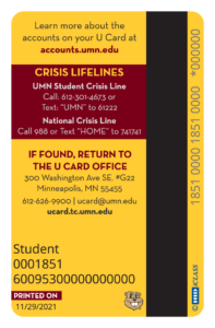
This fall, the U Card Office at the University of Minnesota Twin Cities launched its redesigned ID incorporating contact information for the student crisis and text line as well as the National Suicide Prevention Hotline and text line. The card office spearheaded the project together with the university’s student affairs, health, and human resources, as well the President’s Initiative for Student Mental Health (PRISMH).
One might assume that something as seemingly beneficial as adding crisis lines to the back of a campus card would be straightforward. In reality, however, it is a complex process requiring input and buy-off from many areas at the institution.
Whether mandated via legislation or decided based on student service and wellbeing, this process is one that many campus card programs will face in the coming years.
For the U Card office, it evolved over several years.
The office had been monitoring pending federal and state legislation that could make crisis contact information mandatory on the back of campus ID cards. Concurrently, student government reached out to express students’ interest in seeing this happen.
The office was fully supportive of the idea.
 “Including additional resources for our students and University community around mental health is a no-brainer,” says Stephen Courchane, U Card Office Director. “The U Card Office is proud to champion this initiative.”
They began work with the university’s mental health clinic to determine if the campus crisis numbers would be a good fit for the U Card, given its permanent nature. When it was determined that it would be, the team worked with the marketing offices from the various system campuses to create the new card design.
After gathering the necessary input and approvals, order for the cardstock was placed in June of 2023. The first cards were printed at the start of the Fall semester in late August 2023.
The real estate on an ID card is in short supply so it is a valuable and scarce resource. When something is added, typically something must go.
For the U Card, this decision was not difficult. The existing card back used icons to display the card’s functions such as dining, payment, and access. Because additional functions are added to the card quite often, they determined it was better to rely on the website to provide this information. Removing the icons freed up the space needed on the back of the card.
Nick Mabee, U Card Office Communications & Marketing Manager, led the card redesign project.
“By incorporating these vital resources, we're turning the U Card into more than an ID – it's a symbol of support and community,” say Mabee. “This collaboration underscores our office and the University’s commitment to well-being within our community.”
The new U Card design is now featured on outgoing U Cards on the Twin Cities and Rochester campuses. It is expected to launch on the Crookston, Duluth, and Morris campuses in the coming months.
Whether mandated via legislation or decided based on student service and wellbeing, this process is one that many campus card programs will face in the coming years. The card office at the University of Minnesota Twin Cities is a great example of how a card office can be the driver for this important process.


